

I create visual brand identities
hat stand out and build trust
I work on brands that don’t just “look good”, but are distinctive, authentic and effective.
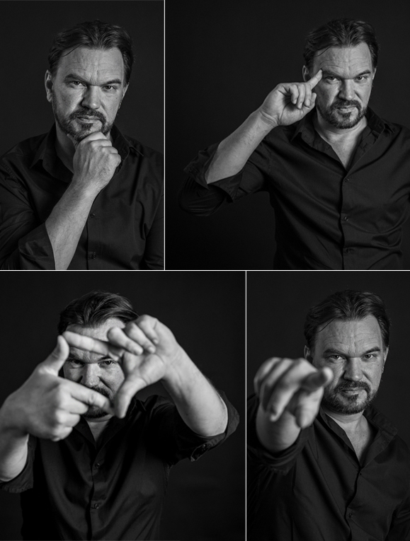
I’m Bálint Nagy-Tószegi, a visual artist, creative professional and founder of Radartworks! I have been working in visual communication for more than 25 years, specialising in visual identity design, brand development, and creative design and execution.
I help businesses, organisations and brands show what makes them special and valuable, and why their products and services are worth choosing.
A visual identity is much more than a logo, a few colours and typefaces. A well-developed visual identity gives a brand character, differentiates it from its competitors, builds trust and consistently communicates the value the brand is meant to represent.
Through Radartworks!, I work on visual identity design, brand development, graphic design, creative concept development, online and offline communication materials, as well as photography.
In my work, I combine strategic thinking with a contemporary approach and more than two decades of practical experience. I don’t work from templates: for every project, I look for its own visual language – one that authentically represents the brand over the long term.
I have worked with cultural and educational institutions, large corporations and SMEs, as well as on numerous events and IT development projects. As a Creative and Art Director, I have also led the implementation of numerous complex visual identity and communication projects and campaigns for companies.
If you are launching a new brand, looking to refresh your business identity, or simply want to make your visual presence more professional, let’s talk.
I turn good ideas into strong brands – and strong brands into recognisable presences.
Everything starts with a recognisable symbol. A logo is often the first impression – and it is often the basis on which people form their first opinion of a business. I create visual trademarks that are not only aesthetically pleasing, but also provide a future direction for the brand. It is not a complete visual identity on its own, but it is the first step towards a developing brand.
The visual communication of an event is both a creative and highly precise task. Every detail matters: the concept, timing, consistency and the ability to react quickly. From smaller events to complex productions, I design complete graphic systems – for digital and print applications, on-site elements and campaign materials alike.
Developing a promising brand does not start with the logo, but with a well-thought-out concept. When designing a visual identity, I work to ensure that your business visually represents exactly what it actually delivers – while also expressing its future promise. The goal is to create a distinctive, authentic visual system that works effectively over the long term.
Visual concepts become truly tangible when they come to life in three dimensions. With 3D visualisations, I help bring an idea to life accurately and convincingly before implementation even begins. For exhibition stands, event elements, interiors or installations, this is a particularly important part of the design process.
Your brand does not communicate through a single touchpoint. Every point of contact matters. I help coordinate the visual and communication elements your audience and customers encounter – both online and offline. The goal is a more consistent, professional and deliberately designed brand experience.
Visual communication is no longer static. Through animation and motion graphics, I help make your brand presence more dynamic and attention-grabbing. I create content that engages your audience more actively and communicates your message more powerfully.
An online presence is essential today – but the experience it provides matters just as much. I design forward-looking, clean web interfaces that not only look good, but are clear, usable and aligned with your brand. Whatever the digital platform, I approach every project from an individual perspective.
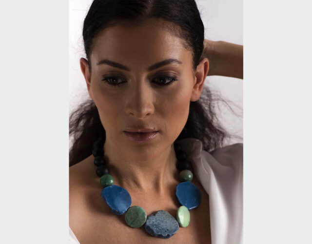
A good photograph does more than document. It conveys atmosphere, character and, above all, a story. Whether it’s product photography, portraits, fashion or events, I create images that consistently support your brand’s visual presence. I work both in the studio and on location, with professional post-production and a considered visual concept.
you want a professional visual presence
you believe in the power of a strong first impression
you finally need a consistent brand image and communication
you are planning to position your services at a higher price point
you know you need to build trust with your target audience
you want to attract more clients and generate more business
you receive personalised, individual solutions
my approach is characterised by strategic branding thinking
the goal is to create a premium, distinctive visual world
I provide personal, direct communication
I am precise and thorough
this is not an agency – there are no hidden costs
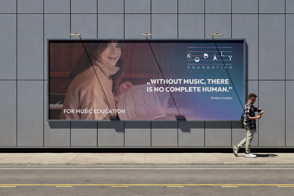
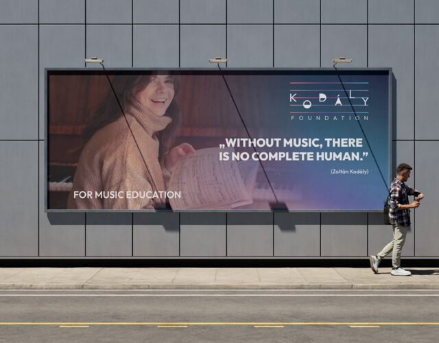
At the request of the San Francisco-based Kodály Foundation, I designed the organisation’s new visual identity. It was one of my true passion projects, as the foundation’s mission – to introduce, promote and teach the Kodály Method throughout North America to both future and practising music educators – genuinely inspired me.
Music is part of my everyday life, so the organisation’s mission truly captivated me. I could hardly have wished for a more beautiful and meaningful assignment: to create a brand identity that places the foundation’s core activities within a contemporary visual and communication framework, raises the foundations of its marketing activities to a professional level, strengthens and sharpens its presence among the wider public, and enables it to communicate more effectively with its supporters and donors.
During the visual identity design process, four different visual directions were developed, each based on a different icon and trademark concept. The final “winning” direction became a playful musical notation and typographic motif that references the methodology of Kodály music education and is built from its elements. The entire visual system was developed around this concept.
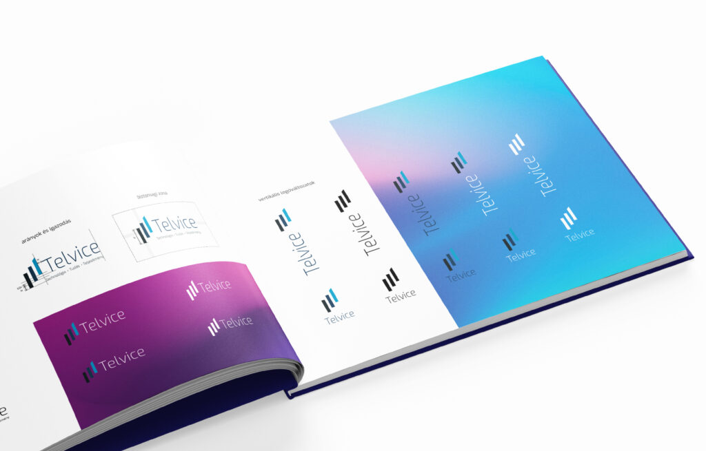
Telvice Zrt. entrusted me with a major assignment: designing the company’s complete brand and visual identity.
The IT company’s rapid development made it clear that its previous brand elements no longer communicated the level of quality, technological innovation and dynamism that characterise Telvice’s operations and professional growth.
The rise of artificial intelligence, together with the company’s achievements in analysing and interpreting data and making complex processes visible, creates a technological and business advantage that generates tangible results for its clients.
Following an extensive and thorough professional consultation process, I developed the new brand identity accordingly. The visual concept centred on data, development, transparency and measurable business results. These elements were brought together into a complex and consistently structured visual language.
The result is a contemporary, distinctive and dynamic brand identity that reflects Telvice’s technological expertise, dynamism and future-oriented thinking.
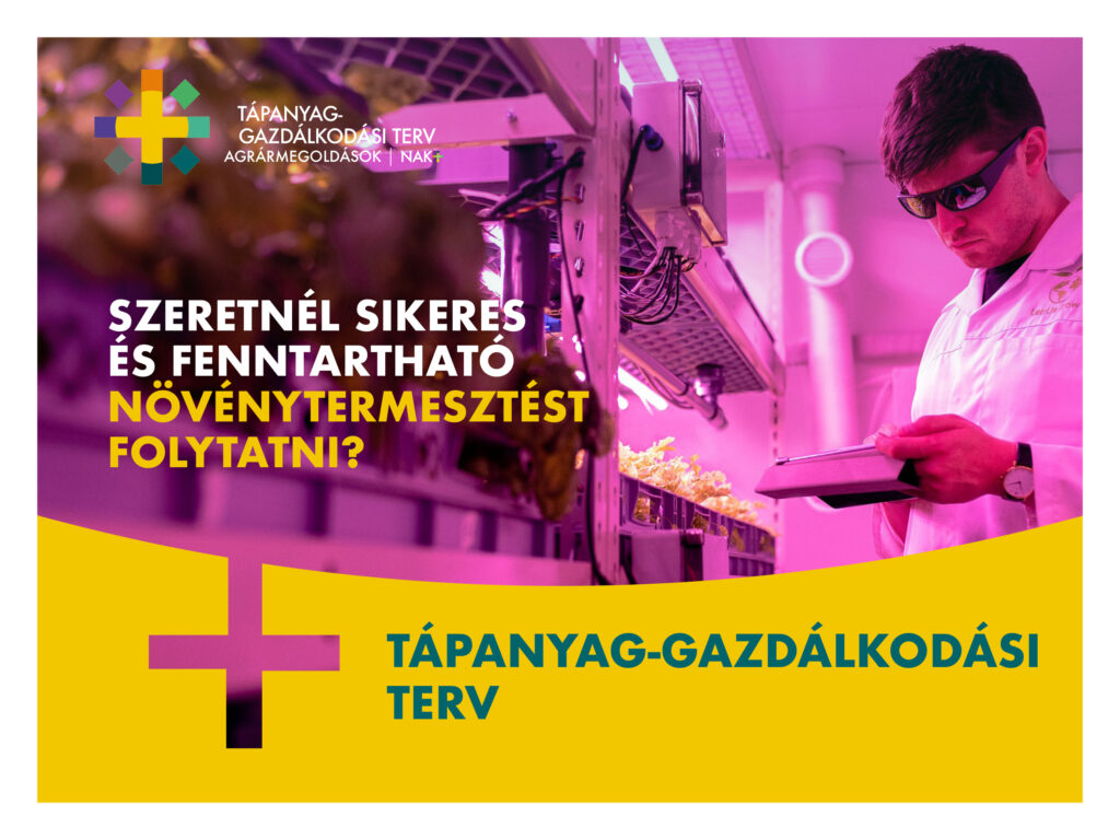
NAK Agrárszolgáltató Nonprofit Kft. provides comprehensive professional and business services to participants in the Hungarian agricultural sector.
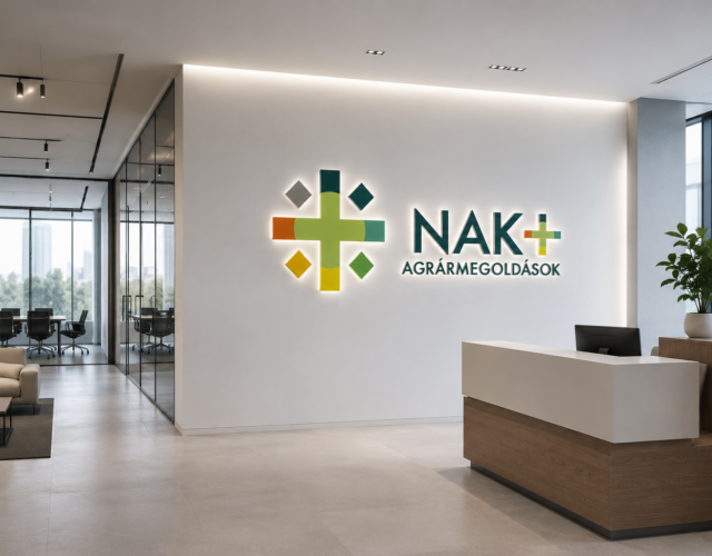
At the organisation’s request, we built the brand from the ground up – from developing the brand name and designing the complete corporate identity system to creating hundreds of online and offline graphic applications.
After extensive professional consultations, the brand name NAK+ was created. In addition to expressing its connection to its owner, the National Chamber of Agriculture, the name also conveys the idea of additional services and added value. The brand encompasses nine different service areas.
The “+” sign became the central motif of the identity, which I integrated into an organic visual system that simultaneously evokes the sun as a source of life and development, and the flower as a symbol of fertility and growth.
I developed the visual identity into a complex, modular brand architecture in which nine independently identifiable service brands sit alongside the central NAK+ brand. The formally consistent symbols are differentiated through a consistent colour-coding system.
The result is a distinctive, functional and highly scalable visual identity system that enables the individual services to communicate independently while maintaining a clear connection to the NAK+ umbrella brand.
>>>>> view
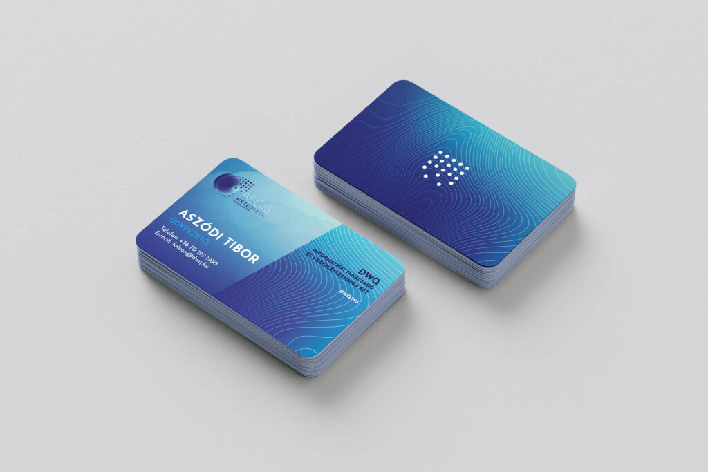
Aegis is the name given to Hungary’s new hail damage mitigation service.
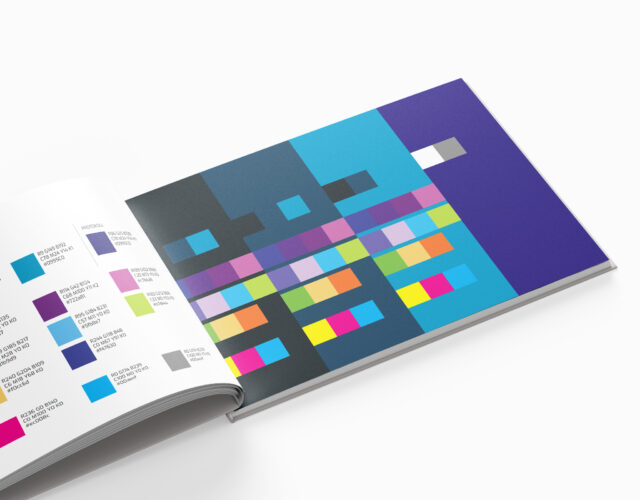
At the company’s request, I designed the identity of the newly established business, its marketing communication materials and website, all brought together into a unified system through a comprehensive brand guidelines manual.
The identity was inspired by meteorological and geological phenomena, visual characteristics and natural forces that have a strong connection to how the service operates.
Rainfall, hail, terrain, atmospheric energies and topographical forms provided the visual elements from which a complex and distinctive logo was created.
Based on the logo, a reduced and easily recognisable icon was also developed, which can be used both as an independent identity element and as a supporting graphic motif.
When developing the colour palette and graphic system, it was important that the identity reflect both the power of the natural phenomenon and the innovative technological background of the service. The process of introducing silver iodide into the atmosphere, used in hail damage mitigation, also provided inspiration for the visual appearance.
The result is a distinctive, unique and expressive identity that brings together natural processes, technological innovation and the concept of protection within a unified visual system.
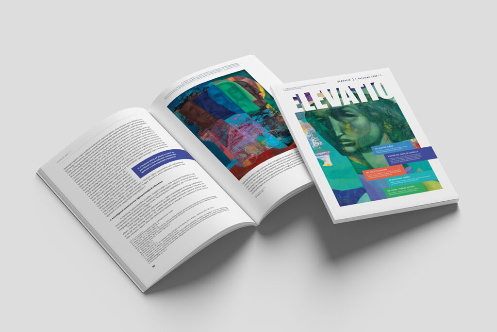
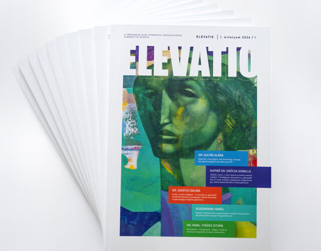
The publication design and typesetting of Elevatio, a scientific and professional periodical founded by the Társadalmi Esélyteremtési Főigazgatóság, represented a genuinely classic yet complex design challenge.
Instead of the familiar, primarily text-based and restrained visual language of academic publications, the goal was to create a more distinctive, expressive and magazine-like publication.
When developing the layout, it was important to keep the extensive textual content easy to navigate and well structured, while enriching the pages with colourful graphic elements, thematic blocks and visual solutions that support understanding.
The typographic system and magazine-style layout are complemented by vibrant, richly painted illustrations. In this way, Elevatio maintains the professional credibility of a scientific publication while moving beyond its traditional visual framework.
We get to know the project.
During our initial consultation, I map out your needs, the background of the project, its goals and expectations. Together, we clarify exactly what problem we are solving and what task we need to address.
We define the task precisely.
Based on our consultation, I prepare the project brief and a precise definition of the assignment, which forms the basis for my personalised professional and financial proposal.
The visual solution takes shape.
Once the brief has been approved, the creative design process begins. I establish the project’s visual direction and then develop the necessary designs accordingly.
I present the developed concept.
The designs are presented in a structured way, together with the professional and visual thinking behind them, so that both the individual decisions and the concept as a whole are clear and understandable.
We refine the design based on your feedback.
Based on the comments and feedback received during the consultation process, I refine the selected direction and then finalise the designs and applications.
The finished materials arrive ready to use.
I deliver the final files in the formats appropriate to the project’s requirements, organised and prepared for further use.